When a business starts building its digital presence, the first question that almost always comes up is: “Do I need a website or a landing page?”
But honestly, that’s not the right question.
The real question is: What do I need visitors to do—and how quickly do I want that to happen?
A website is typically built for depth: building trust, telling a brand story, hosting content, and sometimes supporting long-term organic growth through SEO.
A landing page, on the other hand, has one clear goal: drive a focused action—leave details, sign up, buy, or get in touch.
For years, the difference was sharp and obvious. But in recent years—especially as building and design tools have improved—the line between a website and a landing page has become blurred.
And that’s where the real conversation begins.
Why does this “website vs landing page” dilemma exist in the first place?
Because a “classic” website often comes with a price tag:
- Strategy and structure (planning)
- Design
- Development
- Ongoing maintenance
- And often, long-term dependency on professionals
Not every business needs that, or wants to invest in it, especially at an early stage.
On the other side, landing pages were traditionally seen as something small or temporary: a campaign asset, not a “real presence.”
But reality has changed.
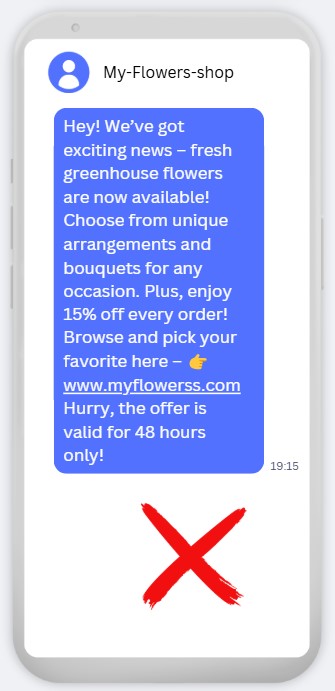
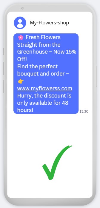
Platforms like smoove now make it possible to build advanced landing pages that, in many cases, offer the same solution—and sometimes an even more effective one—than a full website.
Start with goals, not features
Before we talk design, animations, or menus, pause and ask:
- Do I need to present a lot of content, or lead people to one action?
- Is deep SEO critical, or do I need fast conversions?
- Am I selling a large store, or a service / course / process?
In many cases, the answer is: I need something simple, clear, and conversion-focused—not a complex website.
And that’s exactly where landing pages shine.
Design: way more powerful than you think
Let’s start with design, because this is where one of the biggest myths falls apart.
Landing pages in smoove let you:
- Build with sections (so your page feels structured, not “one long scroll”)
- Fully control colors, backgrounds, and images—real design flexibility
- Add video with a dedicated block
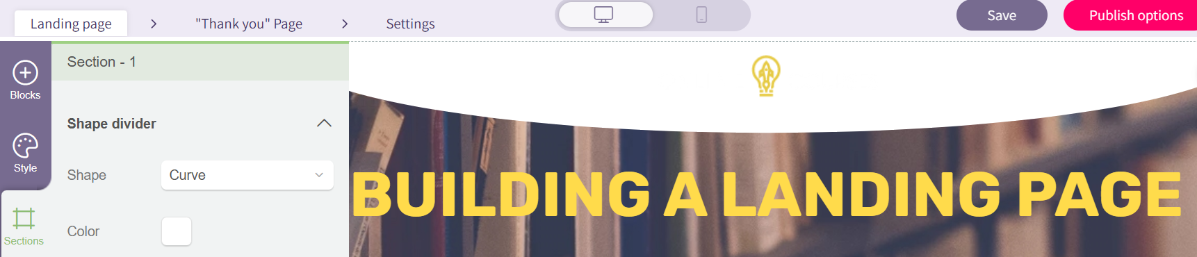
- Create non-linear section transitions (waves, angles, arrows and more—great visual separators)
- Add internal navigation buttons (jump straight to the offer, pricing, or the form)
- Use animations and dynamic movement between content blocks
The result? A one-page website (one-pager) that can absolutely feel like a full site.
Creating a navigation menu:
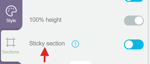
Setting a section as “sticky”:
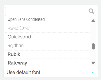
Full flexibility in font selection:
Dividing the page into sections:
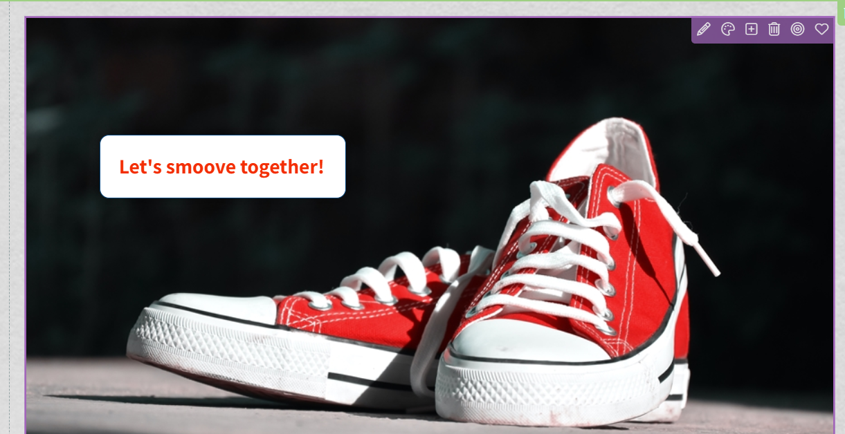
Adding live text over images:
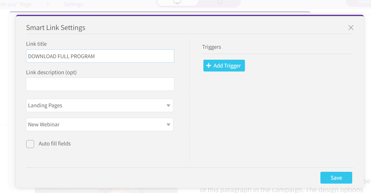
Managing smart buttons for navigation and click tracking:
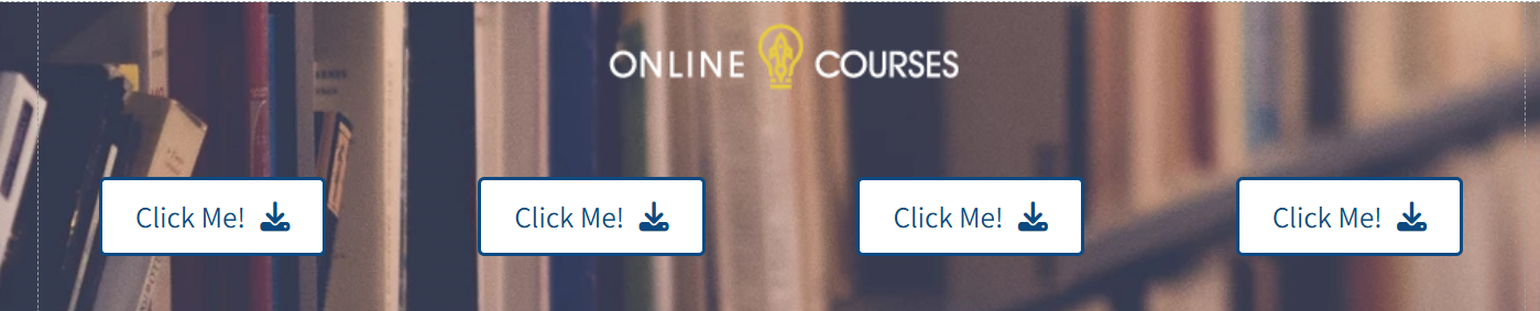
No designer required: building landing pages with AI
Another major upgrade is the ability to create landing pages using AI – on both mobile and desktop.
AI can help you generate:
- A basic structure
- Suggested copy
- A starting design
in minutes
It’s a great solution when you need:
- A quick page
- A way to test an idea
- A short-term campaign page
- Or a fast first version without getting stuck on design
Important note: AI is an accelerator, not a replacement for thinking.
That’s why, alongside AI, you still have a full desktop builder for precise control, perfect for more polished designs or more complex user experiences.
What if I don’t want just one page?
Great question, because who said a landing page has to be single?
You can easily build:
- A home page
- An “About” page
- A testimonials page
- A registration form page
- Blog/article pages
- And anything else you need
How?
Simply create multiple landing pages, one for each “page.”
Connecting the pages: a smart navigation menu
To connect them into a “site-like” experience, you can build a navigation menu using:
- A sticky top section (stays visible as you scroll)
- A column layout
- A button for each page
- Smart links that lead to other landing pages
The result?
A browsing experience that feels like a real website.
Selling online: payments and ecommerce
What if you want to sell through it? No problem.
Connect an external payment provider and embed into your page:
- A product block
- A buy button
- Or an image/button linked to checkout
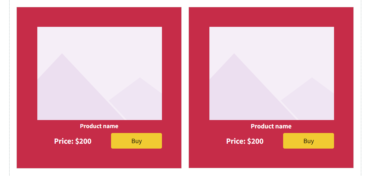
That’s it, you’ve got a functional sales website.
And yes, it can also connect to automations behind the scenes, so you can know who bought what, when, and how much. And as we all know—data is power.
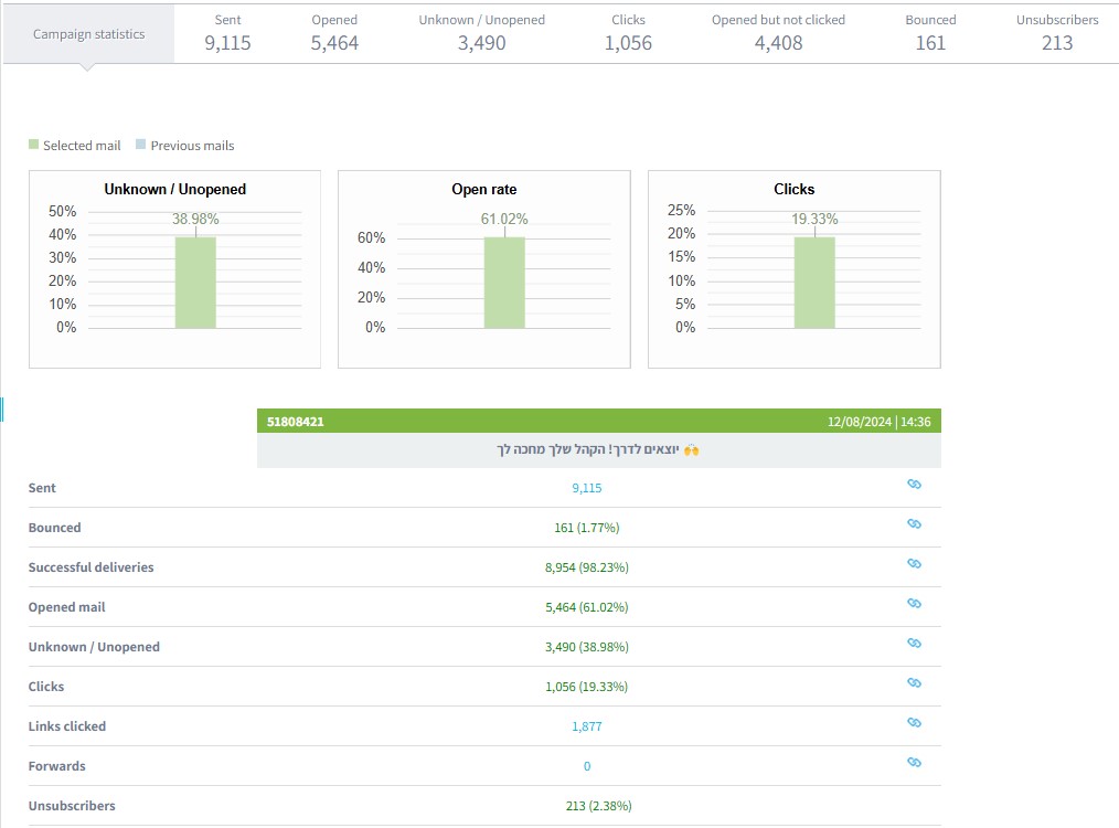
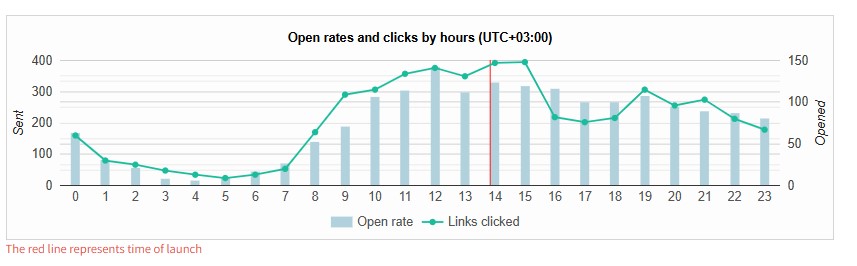
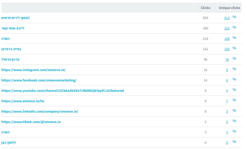
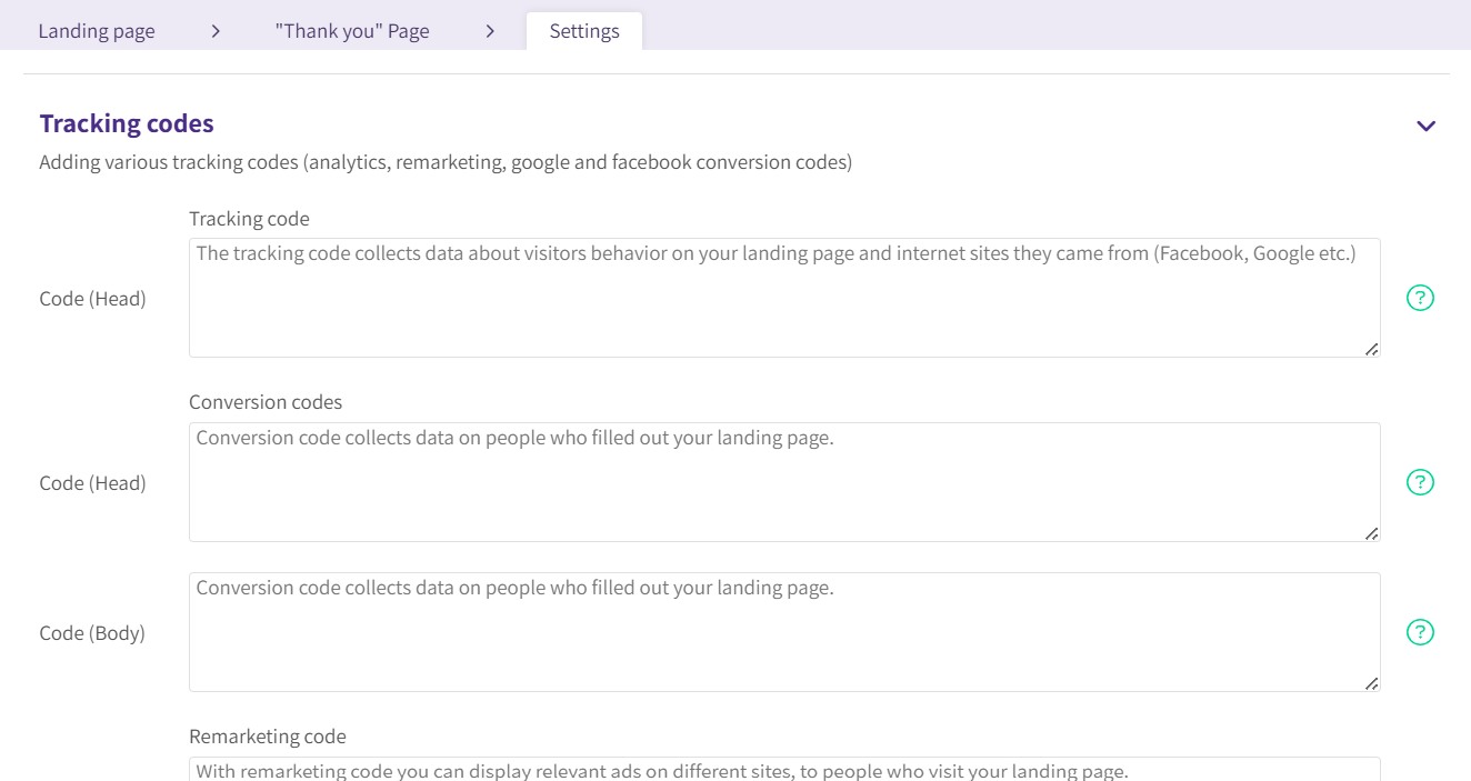
Tracking, analytics, and conversion pixels
When it comes to data, there are no compromises:
- Easy connection to Google Analytics
- Tracking visits per page
- Adding conversion codes (pixels)
- Connecting paid campaigns from social media
Everything you need is there.
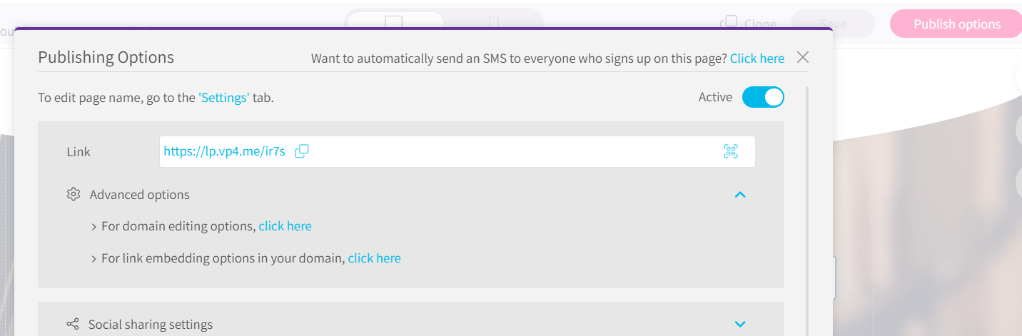
What about a custom domain?
Simple as well.
In the page publishing settings, you can connect a domain you already purchased using basic DNS settings through your domain provider.
And that’s it,your page looks, feels, and functions like a website.
So who is this great for—and who is it not?
A great fit for:
- Small and mid-sized businesses
- Service providers
- Digital courses
- Marketing campaigns
- Anyone who wants to launch fast and test
Less ideal for:
- Heavy content websites
- Complex, long-term SEO projects
- Massive stores with thousands of products
- Custom-coded systems
Bottom line
If you need:
- A simple website
- With selling capabilities
- Analytics and tracking
- Flexible design
- Without investing thousands (or tens of thousands)
You can absolutely build a platform that doesn’t fall behind a “classic” website, and in many cases, it can even perform better.
And of course: everything is fully responsive and mobile-friendly.
So if it’s really that simple—why not? Because it’s still worth pausing, thinking it through, and choosing what truly fits your goals, not what you’re “supposed” to do.